MOCOMO品牌形象设计(上)








MOCOMO
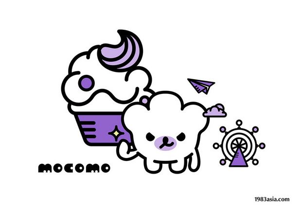
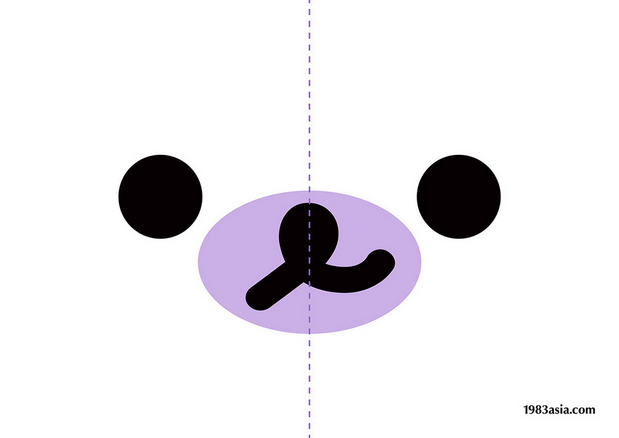
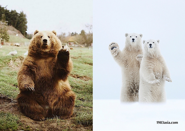
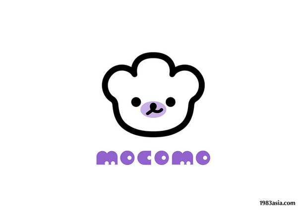
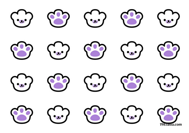
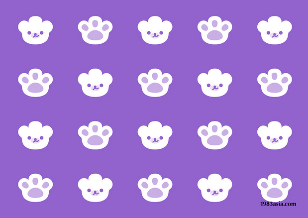
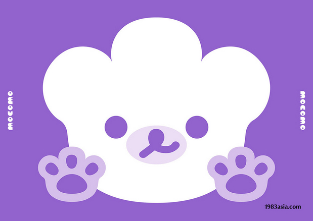
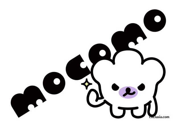
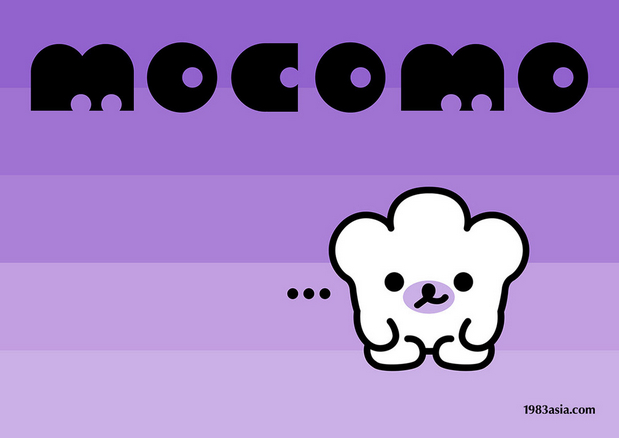
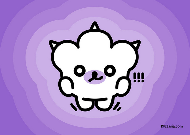
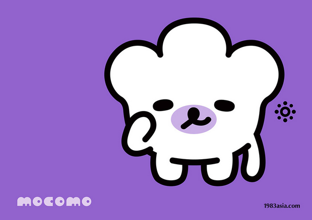
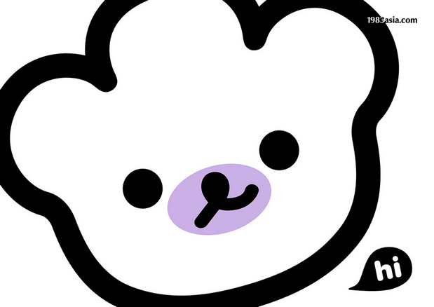
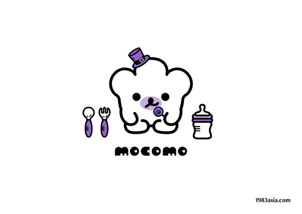
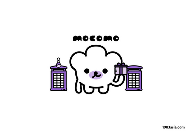
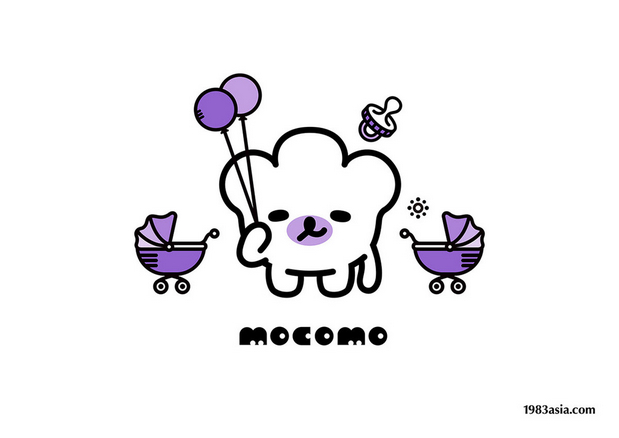
MOCOMO is a maternal and infant brand from Britain. By keeping the brand’s core concept “secure, warm and fun”,1983ASIA uses the satisfying “bear’s palm” image as the design prototype, to convey the core idea of the “warmth of the palm”, uses lavender purple’s imperturbability and softness to boost the sense of sweetness, elegance and playfulness of this brand, and makes them collide with each other harmoniously. Eventually, to form a unique to the brand and the most recognizable visual symbol.
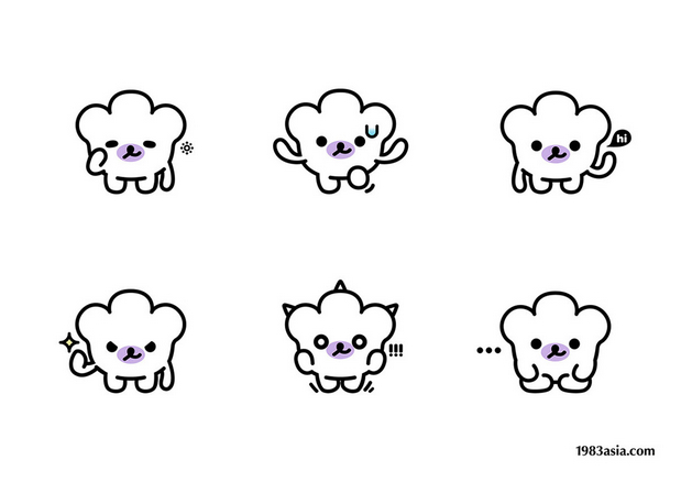
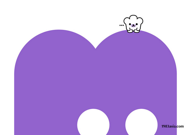
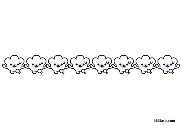
The childlike role setting and the abundant story-type visual design, give the brand so much colorful characters: sometimes sweet, sometimes cool, sometimes naughty, sometimes cute. In this children’s amusement fairyland created by MOCOMO, 1983ASIA hopes children to grow up in the company of MOCOMO, not only knowing how to live in harmony with the world and love life, but also knowing how to feel and send warmth and kindness in the world, since delivering “warmth and reassurance” is the value MOCOMO always try to insist.
All the animals in the world are soothing with their palms, which is the best medium to transmit the warmth. May all the children be gentle with the warm palm.
MOCOMO是来自英国的母婴品牌,1983ASIA延续品牌安心、温暖、趣味的核心理念,围绕核心创意“掌心的温度”,用给人十足安心感的“熊掌”为基础造型,装点上安定柔和的薰衣草紫,让温馨优雅的气质和玩味灵性的魅力相互碰撞,形成专属于品牌且极具辨识度的视觉符号。
童趣的角色设定与丰富的故事型视觉设计,赋予了品牌多姿多彩的性格预设:时而乖萌可爱,时而酷劲十足。在MOCOMO营造的这个童趣乐园里,1983ASIA希望孩子们在MOCOMO的陪伴下成长,既懂得与世界和睦相处、热爱生活,也懂得在世界中感受和散发温暖善意。传递“温暖安心”是MOCOMO一直坚持的价值观。
世间动物皆以掌心抚慰心灵,掌心是传递温度的最好媒介,愿所有孩子都被有温度的掌心温柔以待。
CATEGORY:BRANDING, MASCOT DESIGN 品牌, 吉祥物設計
AGENCY:1983ASIA
DESIGN DIRECTOR:SUSU & YAO 苏素 & 杨松耀
DESIGN:SUSU, YAO, LI ZHUO FENG 苏素, 杨松耀, 李卓芬
YEAR:2017
COUNTRY:UNITED KINGDOM 英国
暖雀网 » 文章或作品为作者独立观点不代表暖雀网立场。本站仅提供信息存储空间服务,不拥有所有权,不承担相关法律责任。本文之内容为用户主动投稿和用户分享产生,如发现内容涉嫌抄袭侵权,请联系在线客服举报,一经查实,本站将立刻删除。本站转载之内容为资源共享、学习交流之目的,请勿使用于商业用途。

